Design Tokens
Manage design system tokens - colors, spacing, typography in structured formats.
Features
- Design token file browser
- Token parsing and visual preview
- Multi-format support (JSON, CSS)
Your design system, organized and visible
Colors, spacing, fonts, and shadows are defined once and used everywhere. But they often live in scattered files or buried in stylesheets where nobody can see them at a glance. When a value changes, you are never sure what it affects.
The Design Tokens applet gives your design system a home inside your project. Define tokens in a structured format, see visual previews of every value, and export them as CSS variables or JSON whenever you need them.
- See every token. Colors render as swatches, spacing as visual bars, typography as live samples. No more guessing what
--spacing-4looks like. - Structured by tiers. Organize tokens into groups and hierarchies that match how your design system is built.
- W3C standard. Follows the Design Tokens Community Group spec, so your tokens are portable across tools.
- Export ready. Generate CSS custom properties, JSON, or CSV from your tokens with one click.
- Lives with the project. Tokens sit next to your code, docs, and other design assets. One source of truth, always accessible.
Adding Design Tokens
To add design tokens to your project, open the Add Applet dialog and select Design Tokens under the Content category.
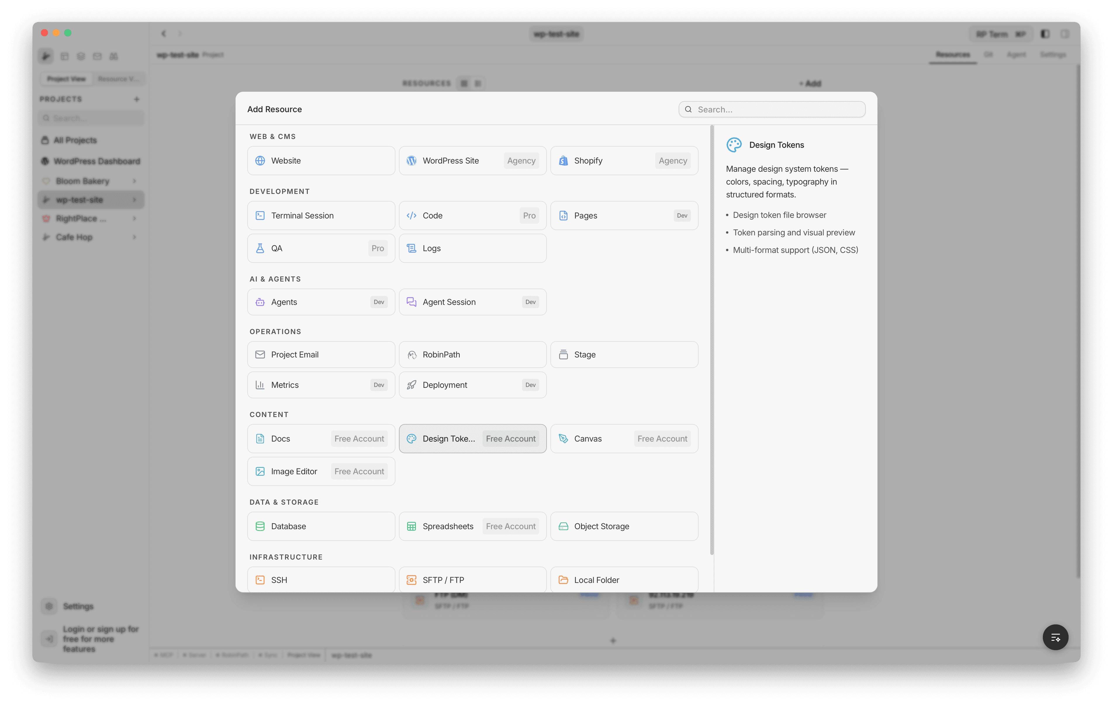
The creation form lets you configure:
- Name: display name for the applet
- Environment (optional): tag for Development, Staging, or Production
- Description: describe the purpose of the token set
- Template: choose a starting point from the template picker
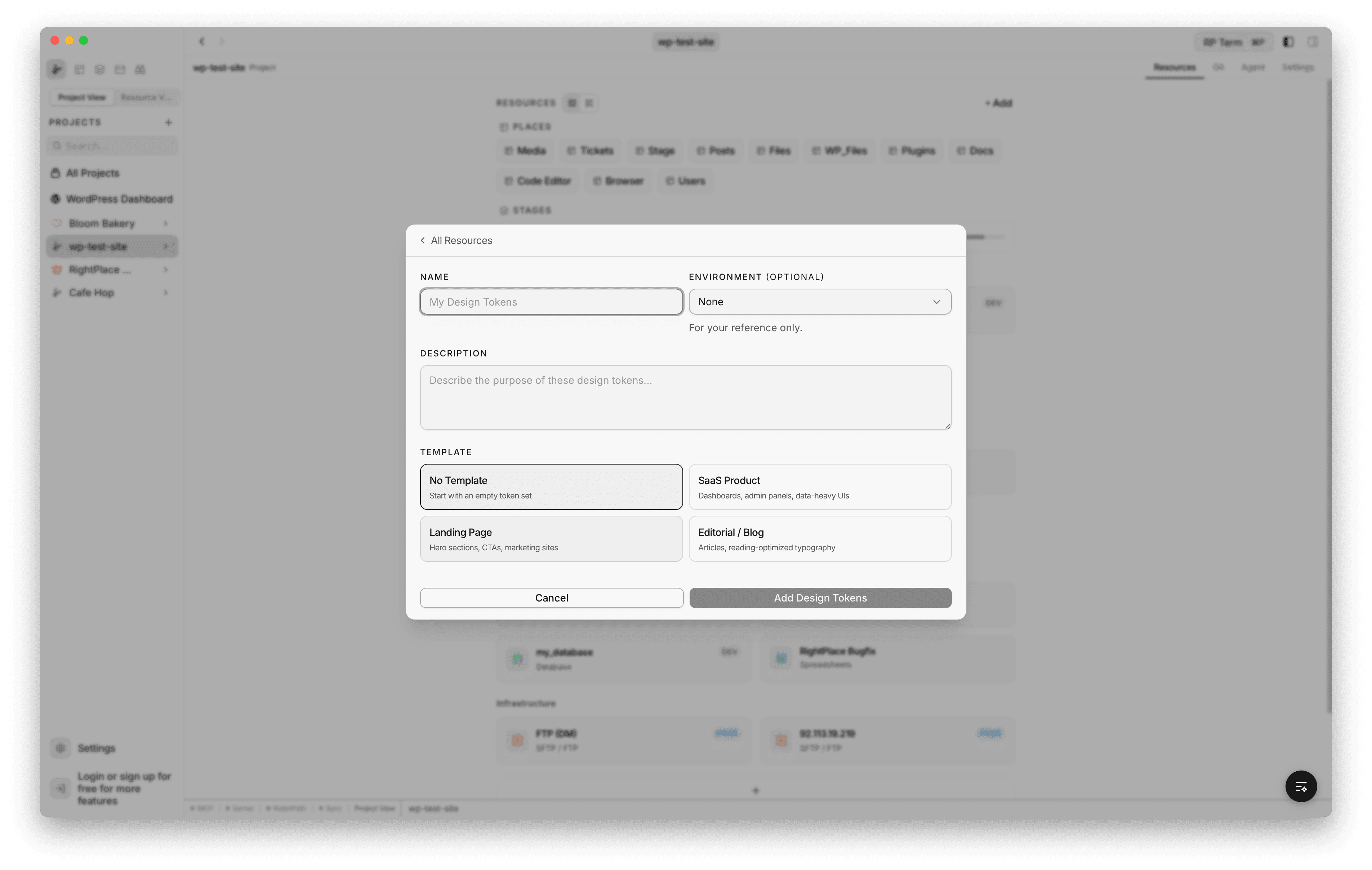
Templates
Four templates are available to bootstrap your token set:
- No Template: starts with empty
baseanduitiers - SaaS Product: blue primary palette, clean neutrals, systematic spacing, Inter font stack. Pre-built groups for colors, spacing, typography, border-radius, shadows, and common UI components (button, input, card, nav, alert)
- Landing Page: teal primary with accent purple, generous spacing. Includes brand identity tokens, gradients, and marketing UI components (hero, CTA, sections, feature cards, testimonials)
- Editorial / Blog: stone/earth neutrals with serif-first typography optimized for reading. Includes heading, body, caption, and blockquote typography groups along with article layout tokens
Each template creates two or more tiers pre-filled with production-ready token values.
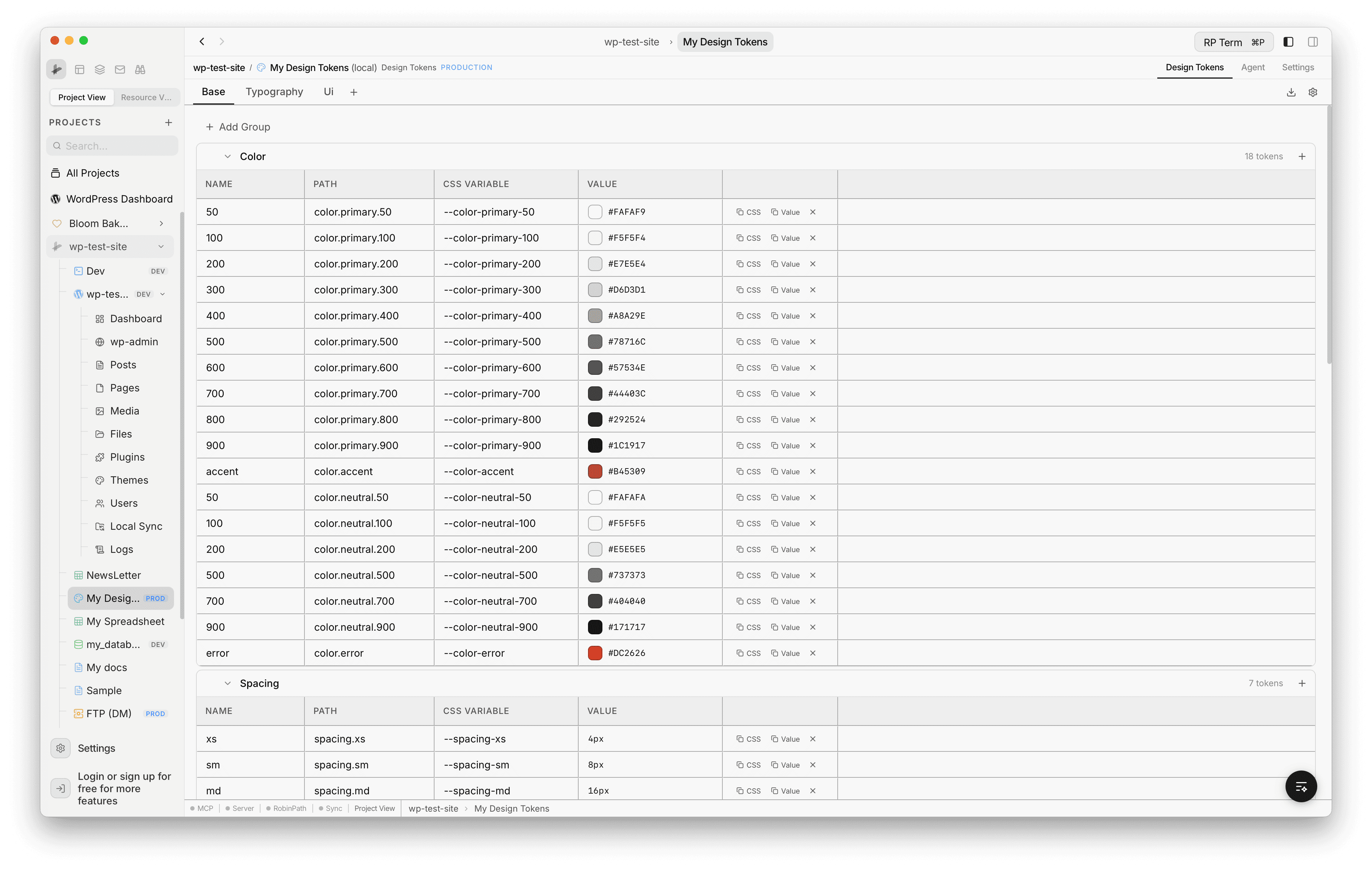
Token Panel
Once created, the design tokens panel shows tier tabs at the top, token groups as collapsible accordions, and a token table inside each group. Each row displays the token name, full path, generated CSS variable, and an editable value cell.
Tiers
Tokens are organized into tiers, which are separate files that layer on top of each other. Lower tiers define base primitives (colors, spacing scales) and higher tiers reference them for component-level decisions (button colors, card spacing).
- Switch tiers by clicking the tier tabs at the top (e.g. Base, Typography, Ui)
- Add a tier: click the + button next to the last tab. Type the name and press Enter.
- Rename a tier: click the tier name to edit it inline. The underlying file is renamed on disk.
- Delete a tier: hover over a tier tab and click the delete icon. At least two tiers must remain.
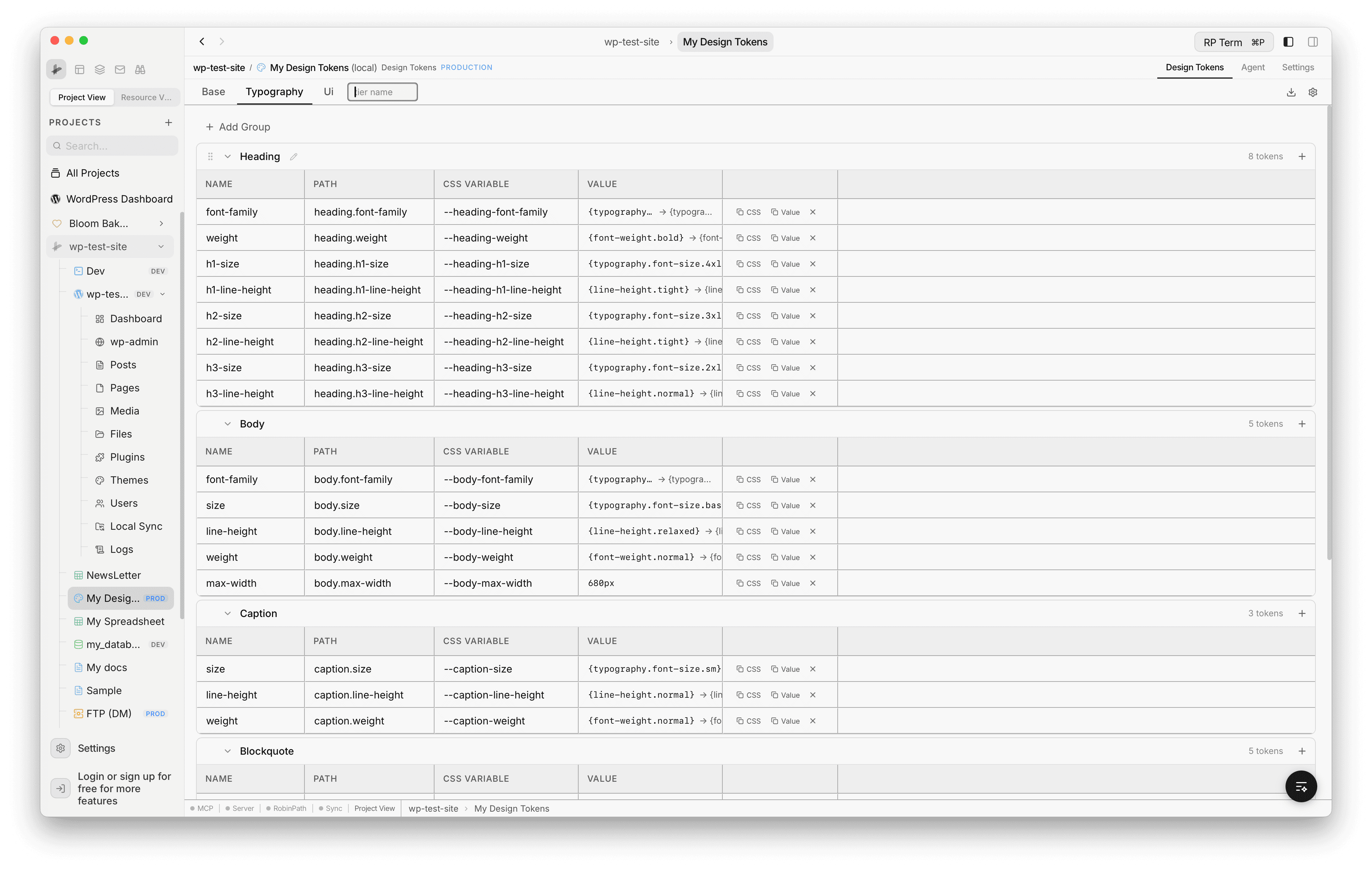
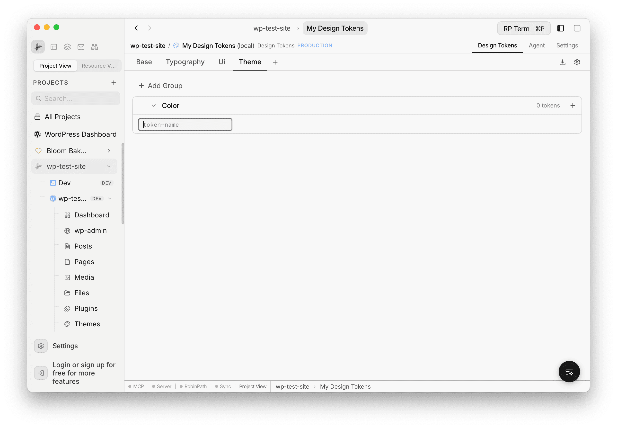
Token Groups
Within each tier, tokens are organized into groups based on their top-level category (e.g. color, spacing, typography).
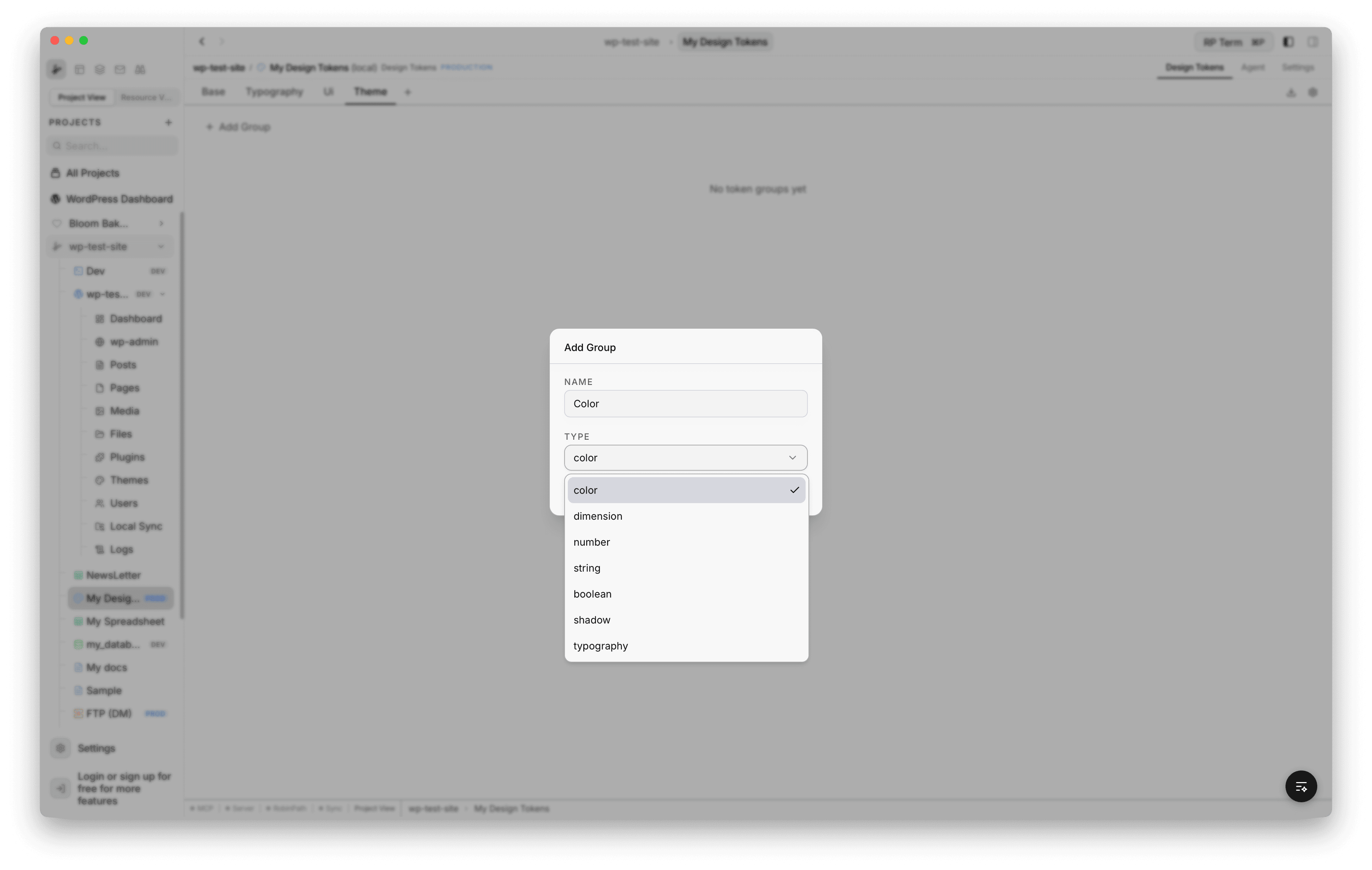
- Create group: click + Add Group to open the group modal. Enter a name and choose a token type from the dropdown.
- Edit group: click the pencil icon on a group header to change its name or type.
- Delete group: click the trash icon on a group header. A confirmation dialog appears since this deletes all tokens in the group.
- Collapse / expand: click the group header to toggle. Collapsed state is remembered across sessions.
- Reorder groups: drag groups by their handle to change the display order.
Token Types
Each group has a type that determines how its tokens are edited. Seven types are supported:
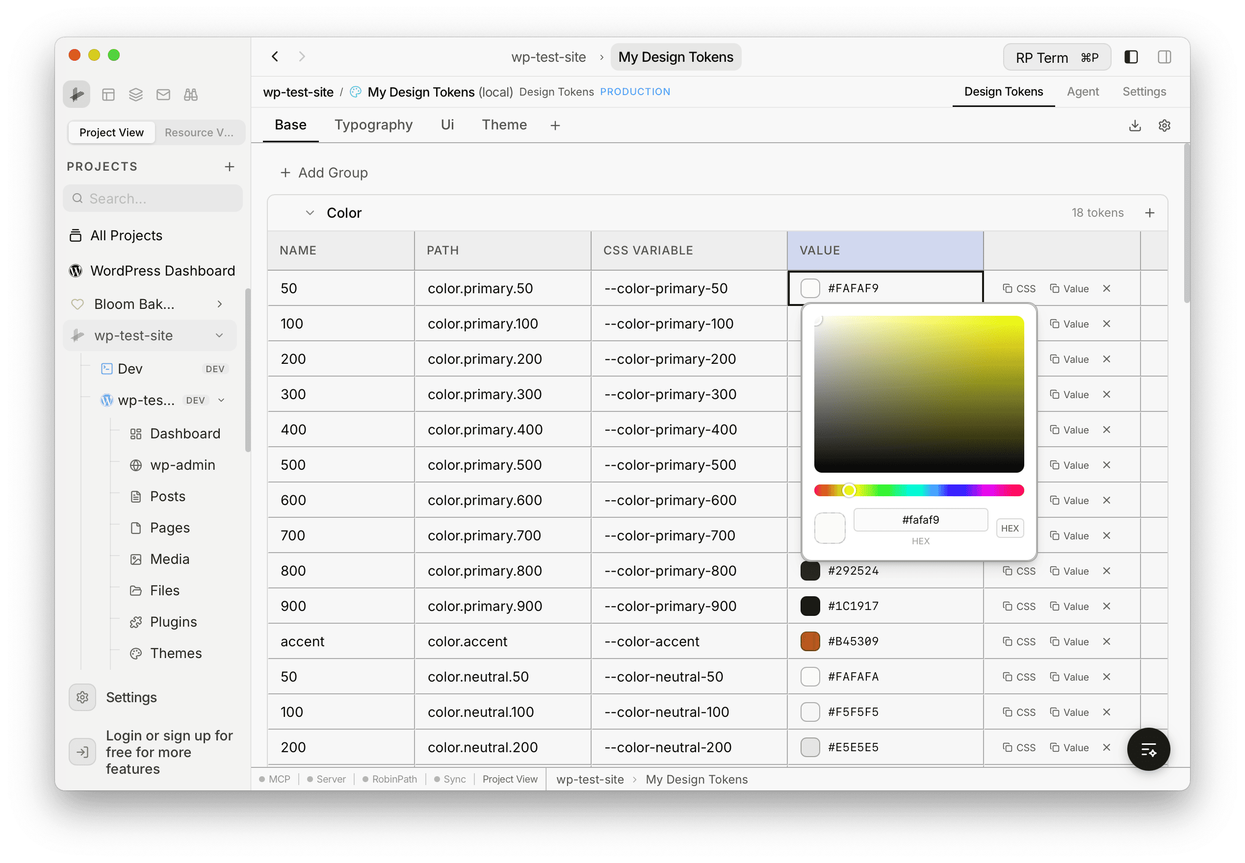
- Color: color picker + hex input. Click the swatch to open a full color picker.
- Dimension: number + unit dropdown. Units: px, rem, em, %, pt, vw, vh.
- Number: number input for simple numeric values.
- String: text input for free-form text (e.g. font families).
- Boolean: toggle switch for true or false.
- Shadow: composite editor with fields for offsetX, offsetY, blur, spread, and color.
- Typography: composite editor with fields for fontFamily, fontSize, fontWeight, lineHeight, letterSpacing.
Working with Tokens
Tokens within each group display in a table with four columns:
- Name: the token’s leaf name, editable inline
- Path: full dot-separated path (e.g.
color.primary.500) - CSS Variable: generated variable name (e.g.
--color-primary-500) - Value: type-aware editor cell
Each row also has quick-action buttons to copy the CSS variable, copy the value, or delete the token.
Creating Tokens
Click the + button on a group header to add a new token. An inline input appears where you type the token name and press Enter.
Editing Color Values
Click the color swatch next to any color token to open a color picker popover. You can pick a color visually or type a hex value directly. The hex input at the bottom supports manual entry.
Alias References
Tokens can reference other tokens using the W3C DTCG alias syntax: {path.to.token}. This is how higher tiers reference lower tiers. For example, a heading font-family token in the typography tier can reference {typography.font-family.serif} from the base tier.
- References work across tiers (higher tiers can reference any lower tier)
- The UI shows both the raw reference and the resolved value with an arrow (
->) - Circular references are detected and the raw value is displayed as a fallback
Save and Revert
Edits are made in-memory. When you make changes, a save bar appears at the top showing the number of unsaved changes with Revert and Save buttons.
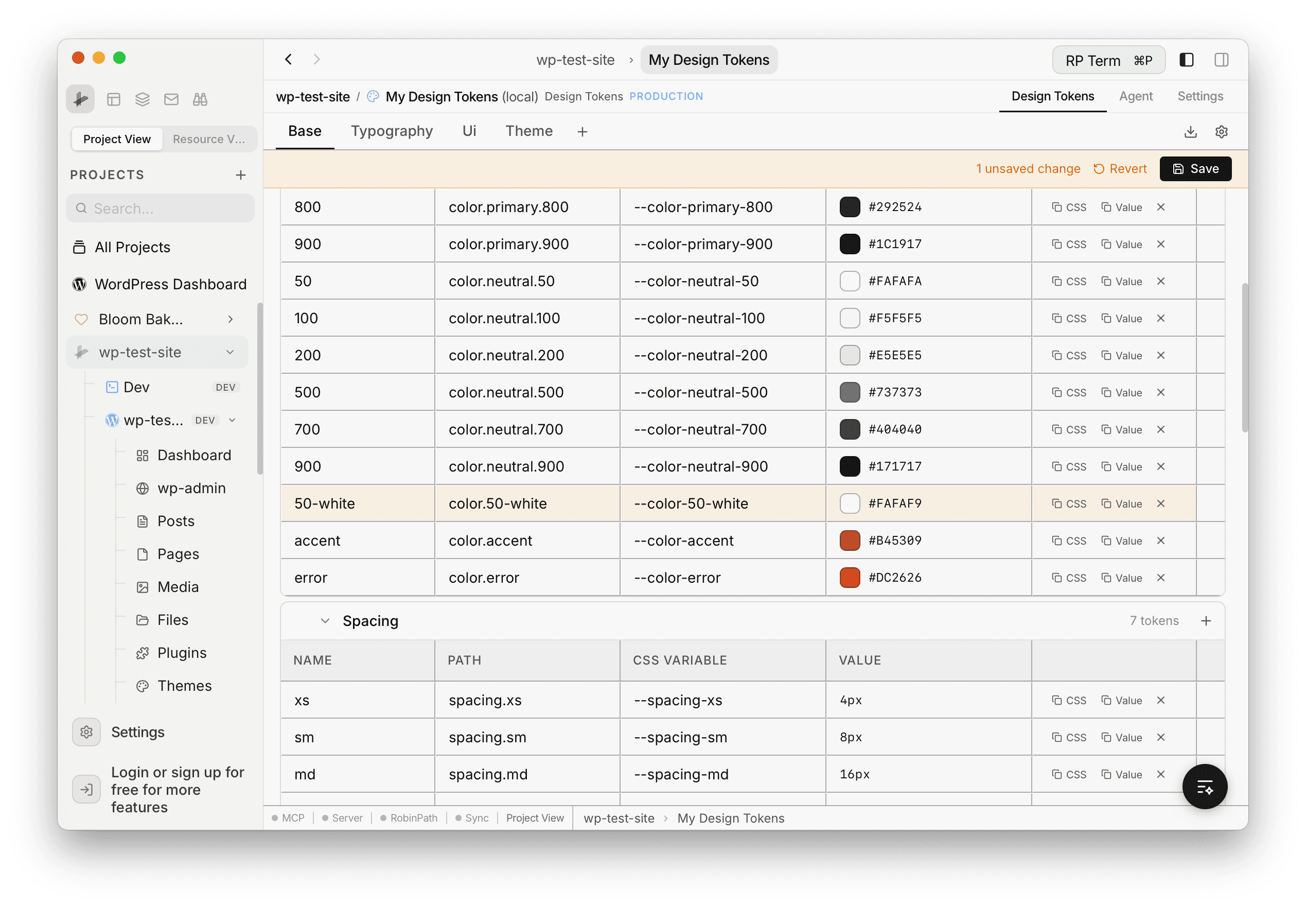
- Save: writes all modified tier files back to disk
- Revert: discards in-memory changes and reloads from disk
Settings
Click the gear icon in the toolbar to open the Settings modal.
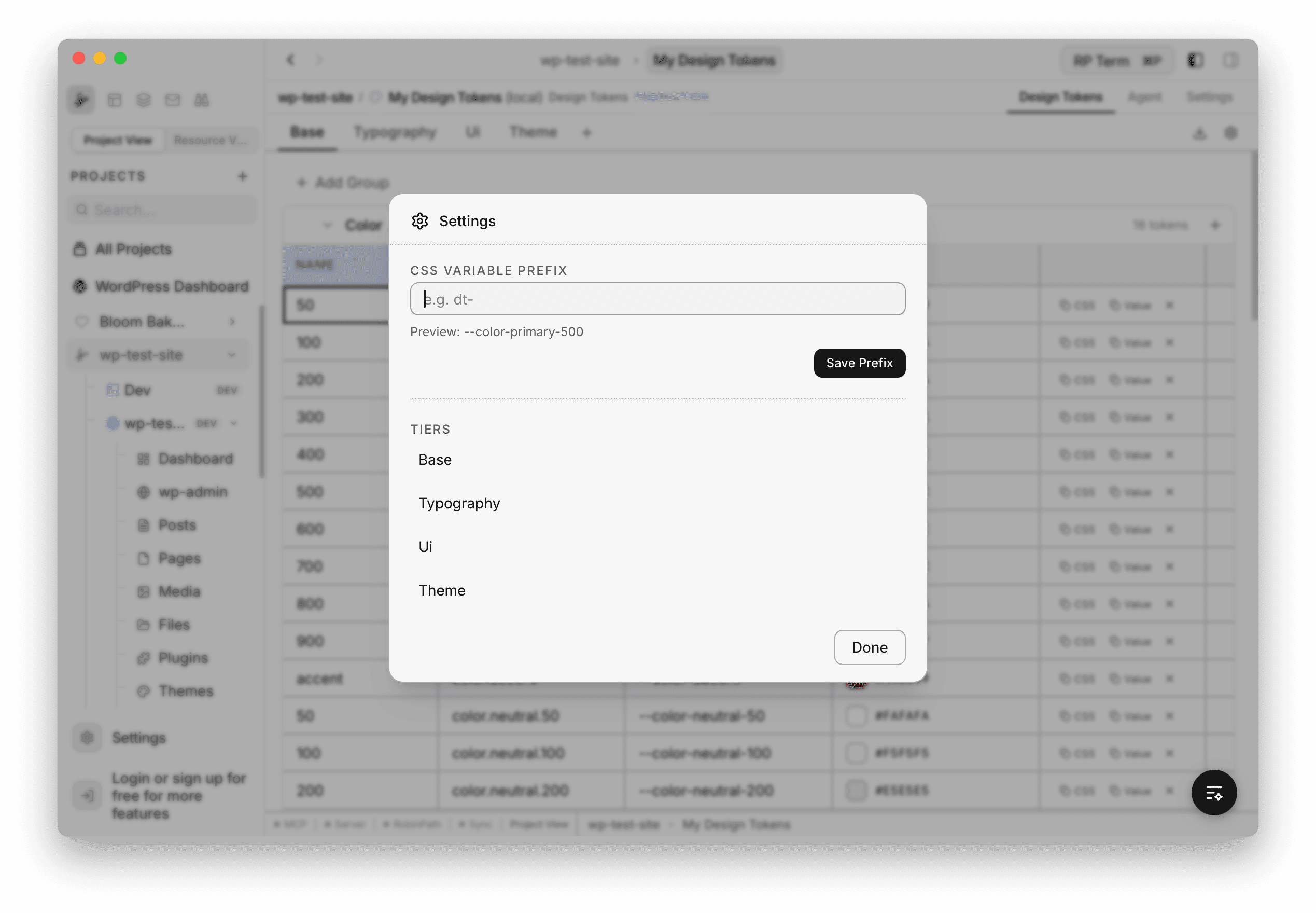
The settings modal includes:
- CSS Variable Prefix: set a prefix for all generated CSS variable names. A live preview shows how the prefix affects the output (e.g. entering
dt-changes--color-primary-500to--dt-color-primary-500). The prefix applies to all exports. - Tiers: a read-only list showing all tiers in the current token set.
Export
Click the download icon in the toolbar to open the Export Tokens modal with three format options:
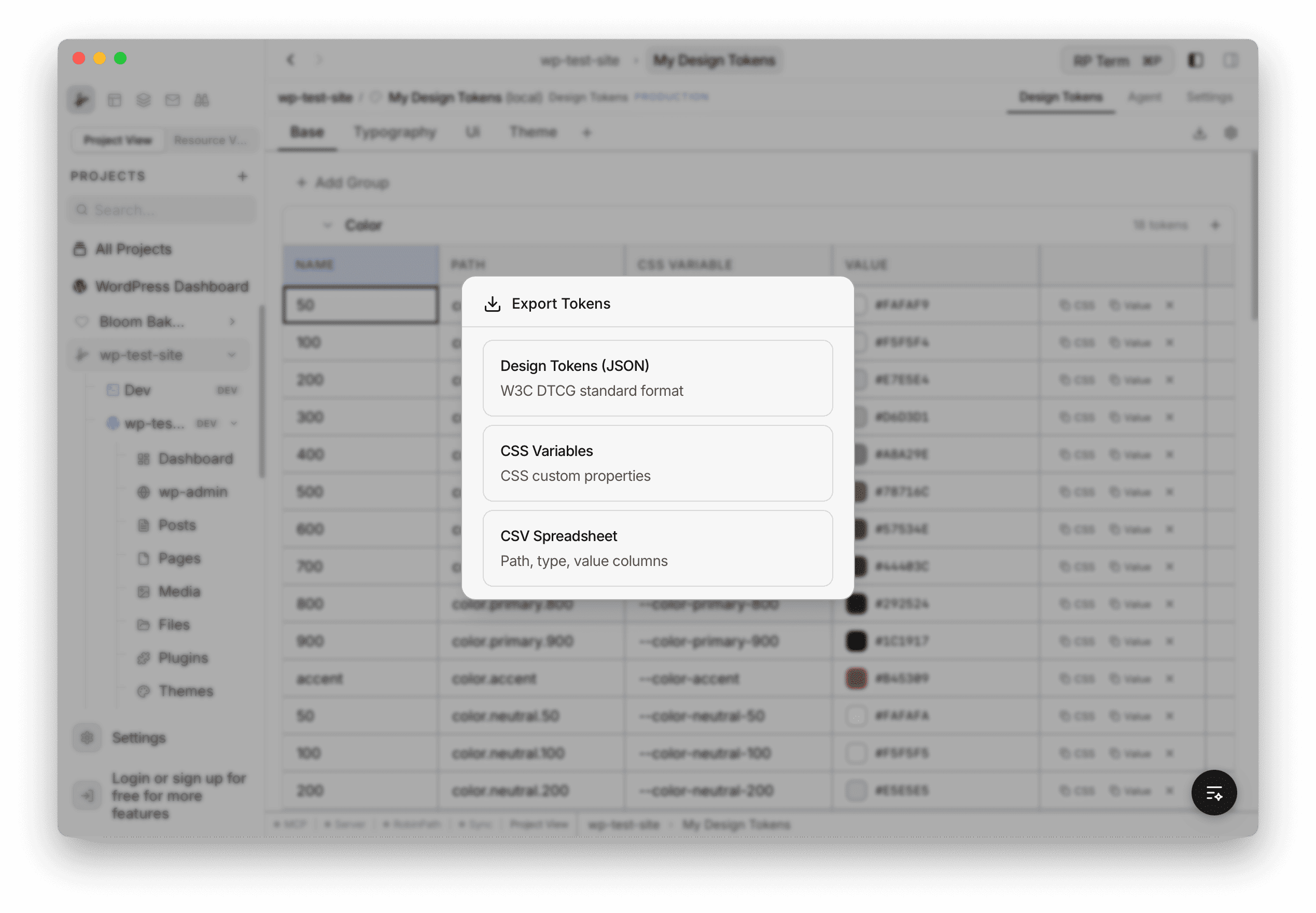
- Design Tokens (JSON): W3C DTCG standard format with all tiers merged into a single
.jsonfile - CSS Variables:
:root { }block with all tokens as CSS custom properties in a.cssfile - CSV Spreadsheet: path, type, value, and css_variable columns in a
.csvfile
Clicking a format opens a native save dialog to choose the file destination.
Session Persistence
The panel remembers your state across tab switches and app restarts:
- Active tier selection
- Collapsed/expanded state of each group
- Scroll position
File Structure
Design token files are stored on disk inside your project folder:
your-project/
  rightplace/
    design-tokens/
      my-tokens/
        .rightplacedesigntokens
        config.json
        base.tokens.json
        typography.tokens.json
ui.tokens.json.rightplacedesigntokens: marker file with metadata (id, name, description, version, creation date)config.json: stores the CSS variable prefix and the list of tiers{tier}.tokens.json: token data for each tier in W3C DTCG format
Agent tools
Every action this applet exposes as a typed, permissioned tool that agents can discover and run over MCP, the same actions your team uses in the UI.